A responsive redesign of a local soap & candle business’ website.
TL;DR: A Summary
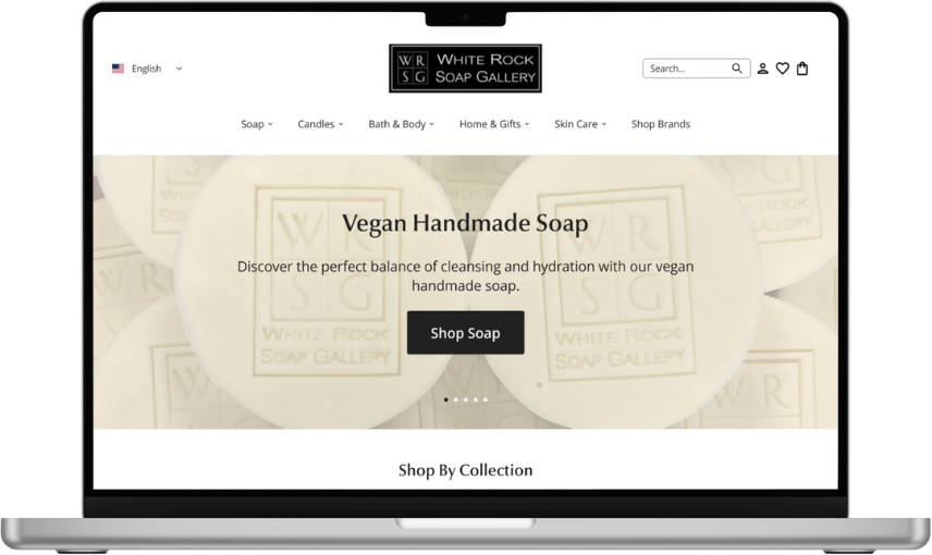
The White Rock Soap Gallery website was redesigned to improve hierarchy and information architecture, readability, and consistency, which were issues identified while conducting user research. Maintaining the current business branding, a new responsive design was created based on the original website.
Role
UX Designer & Researcher
Timeline
March 2024 - May 2024
Background
White Rock Soap Gallery (WRSG) offers all-natural, vegan home and body products. It began as a small operation out of the owners’ home before scaling up into four brick-and-mortar stores across the Dallas area. It’s best known for its vegan, handmade soaps, and it also showcases other Texas-made local brands. The first brick-and-mortar store has been in operations for over eight years.
Though the WRSG website is currently responsive, navigating the website is difficult. The goal of the redesign is to increase the ease of navigation for users to encourage shopper retention and increase customer satisfaction as being able to easily find the products they are searching for will increase the chances of customers buying from the business, thus increasing sales.
Understanding the Problem Space
Identifying Problems in the Problem Space
A general evaluation of the current WRSG website revealed poor, inconsistent organization of a large quantity of information presented to users. Such inconsistency makes the website look messy, disorganized, and confusing to navigate. WRSG stakeholders, in previous conversations prior to the start of this project, also noted inconsistent typography, with multiple fonts being used in different areas across the site.
Meeting the Users
User interviews with 6 participants revealed the following key findings:
Considerations When Buying Bath, Body, and Fragrance Products — Users primarily considered factors such as product scent, packaging, ingredients & environmental considerations (e.g. cruelty free), reviews, and price & value.
Shopping Habits — Half of the participants purchased BBF products both in-store and online; two participants only shopped in store, and one participant preferred to shop online. Shopping in-person gave the user the ability to smell and test the product, whereas the online shopping experience was described to be more convenient and comfortable (no interactions with store employees needed).
Preferred Stores — Where users bought their BBF products from can be categorized into four categories: specialty stores, higher end stores, retail and budget stores, and small businesses/local markets/festivals.
User Website Evaluation and Shopping Task — Overall, users noted many visual and UX concerns, specifically relating to inconsistent product photography on the website, the vast number of filters on product search pages, small font, and long product descriptions.
The most common thing observed amongst users was confusion relating to purchasing a specific candle scent due to how the client organizes their products on its website.
Knowing this, how might we…
help people who buy bath, body, and fragrance products easily find products in scents they like and/or are compatible with?
help make it easier for WRSG shoppers to browse the website?
help WRSG as a company improve how its products are displayed and organized on the website?
Prioritization & Information Architecture
Understanding Project Goals
Three main goals were established for this project. These goals went beyond the design of the product itself and took into account user goals, business goals, and technical considerations.
To make discovering new bath, body, and fragrance products that fit the users’ preferences and budget easier
To entice new customers to make their first purchase and encourage returning customers to shop with WRSG again
To create a satisfactory, enjoyable, and easy to understand experience that can be found on desktop or mobile
Feature Prioritization
Ideas were generated for potential features to include in the upcoming product’s design. After prioritizing which features to include in the minimal viable product (MVP), these features were considered high priority.
Redesigned Home, Product Listings & Details, and Cart Pages
Standard e-commerce pages that users will see as they navigate around the site, explore products, and add items to a virtual cart to purchase. The presentation and organization of information on these pages are top priority to ensure ease of use and readability.
Improved Navigation with Search Bar
Navigation and search allow for users to both explore products and also locate specific ones. With WRSG’s large inventory, it’s necessary to give users a way to find products that fit their lifestyle, preferences, and interests.
Indicator of Product Variations
Helper text or similar present on a product listing that will give users a visual cue that if they click and proceed to the product details page, they will be able to see more variations for a product, like scent or color. The indicator aims to reduce user confusions about finding a specific product variation.
Improved Product Filters
The types of filters present on the product listing page will be reconsidered to make them more relevant to user needs. Additionally, filters will be collapsible in order to reduce clutter and allow users to focus on filters they want to use.
Bringing Ideas to Life: Wireframing
Low-fidelity Wireframes
Low-fi Desktop Wireframes
Full preview of all low-fidelity desktop wireframes can be accessed here.
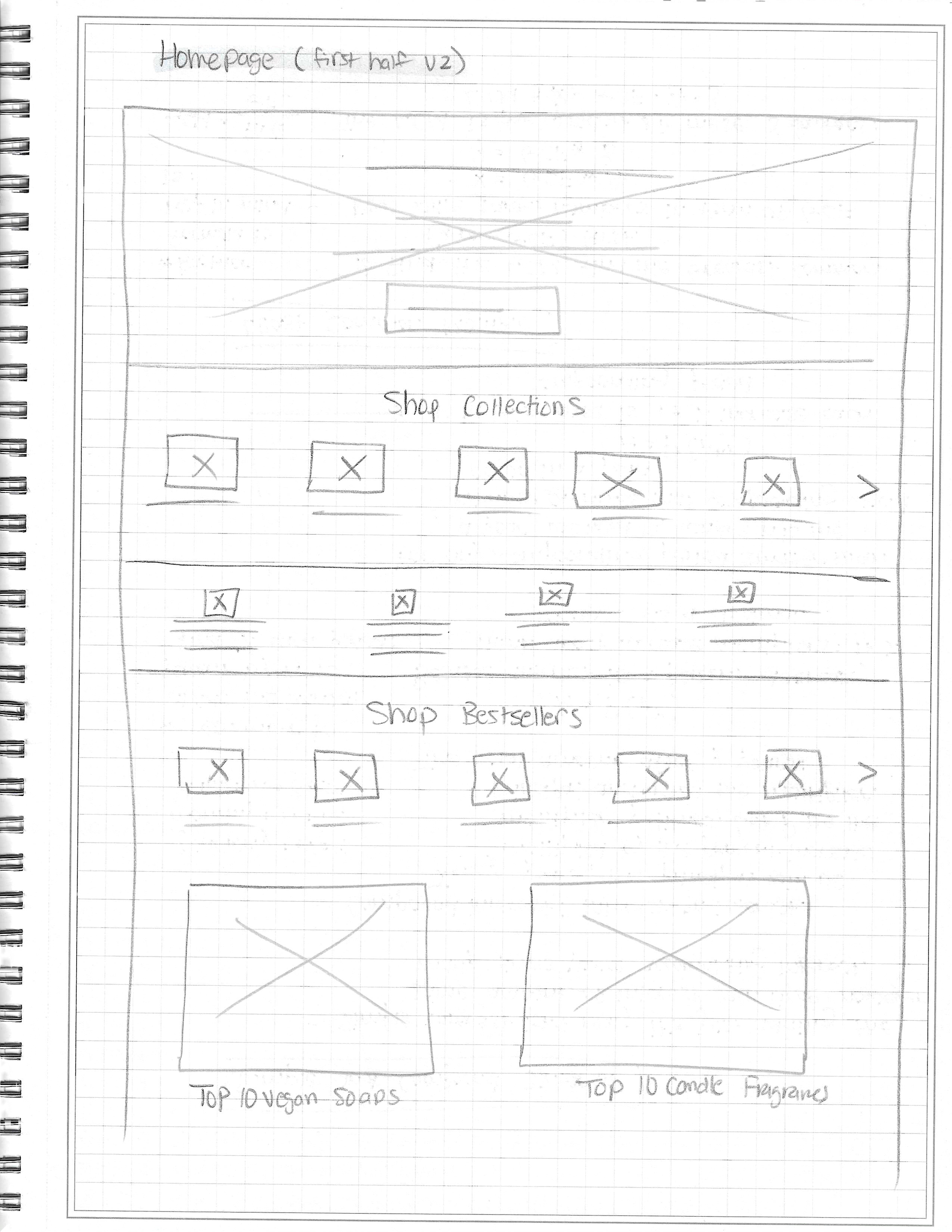
Figure 1. Sketch of top half of desktop home page, version 2
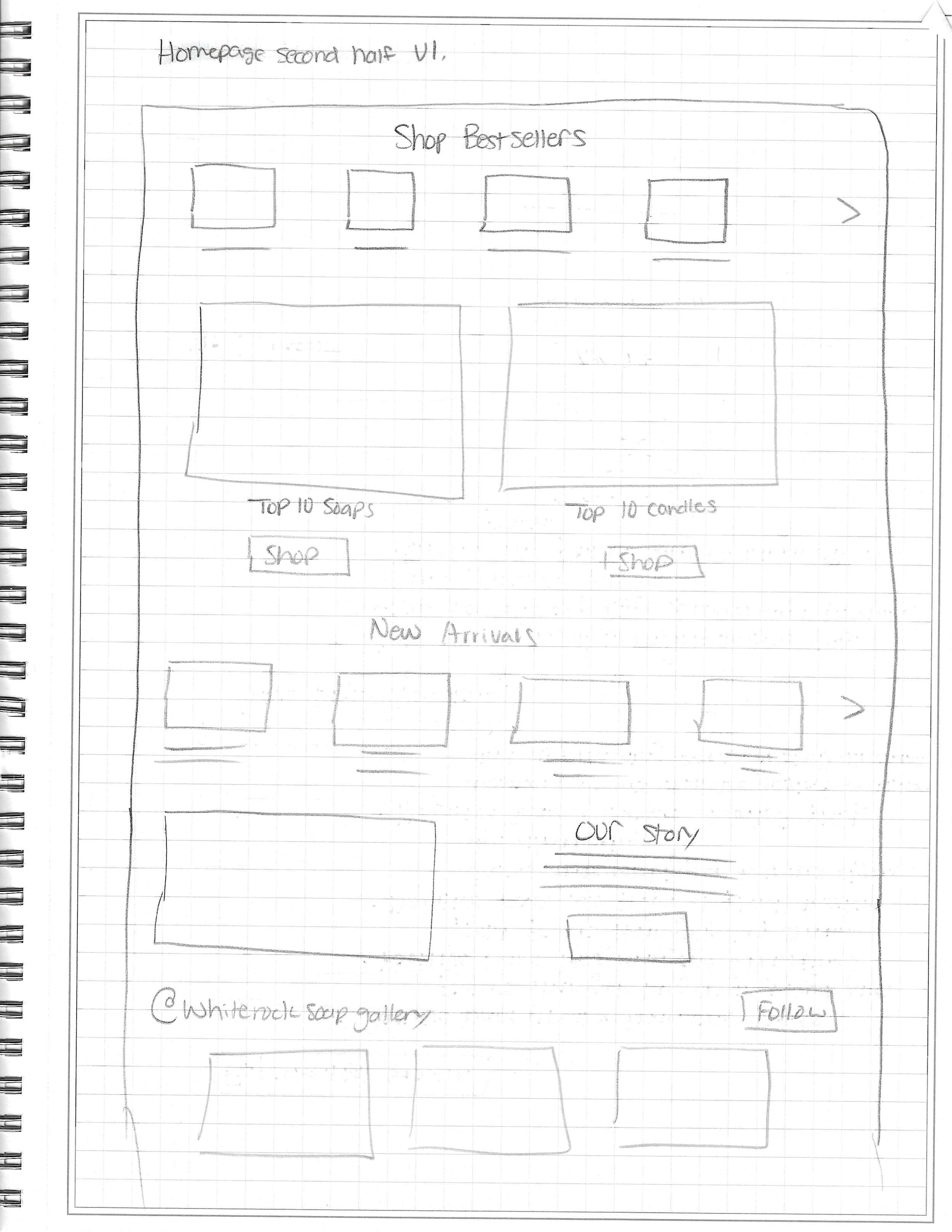
Figure 2. Sketch of bottom half of desktop home page, version 2
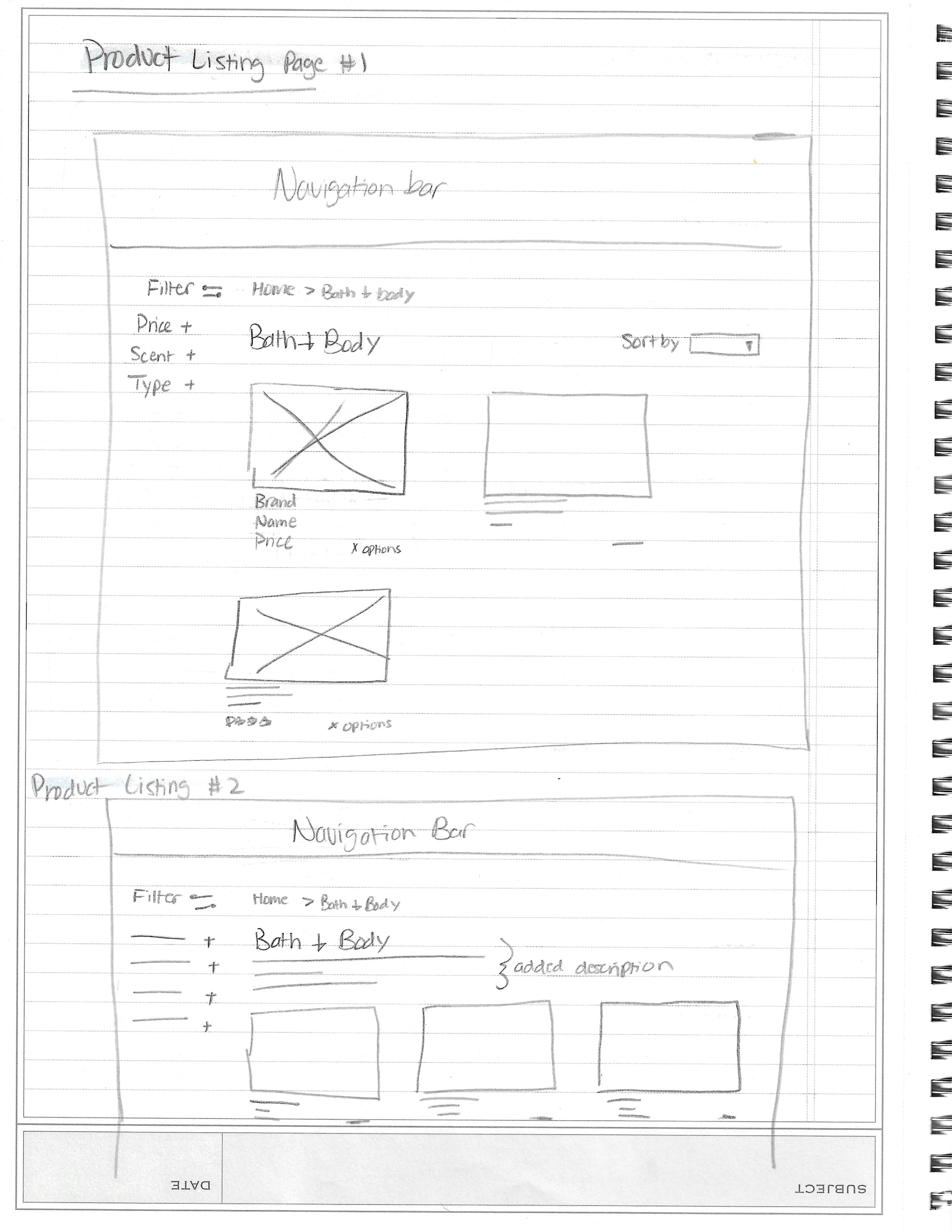
Figure 3. Sketch of desktop product listing page
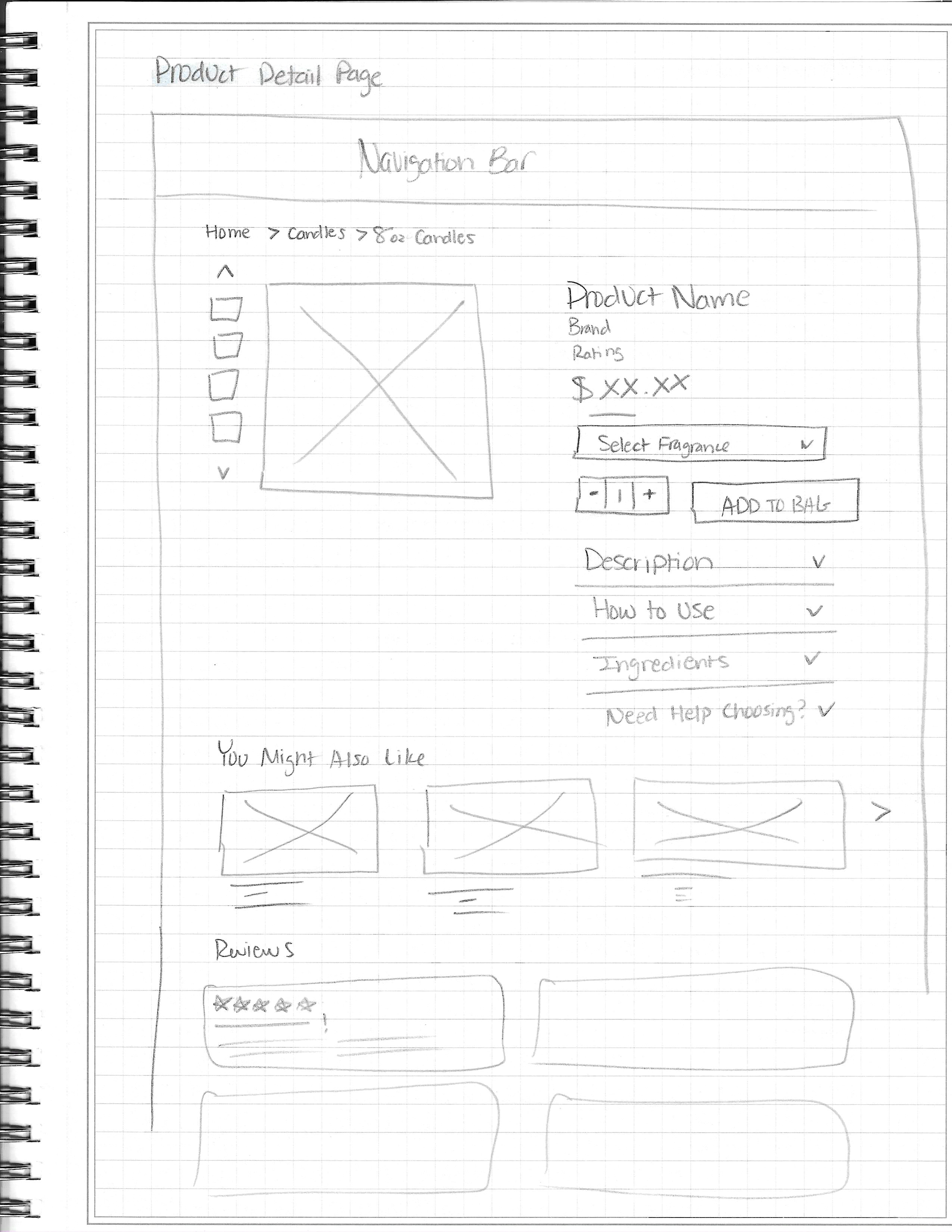
Figure 4. Sketch of desktop product details page with reviews.
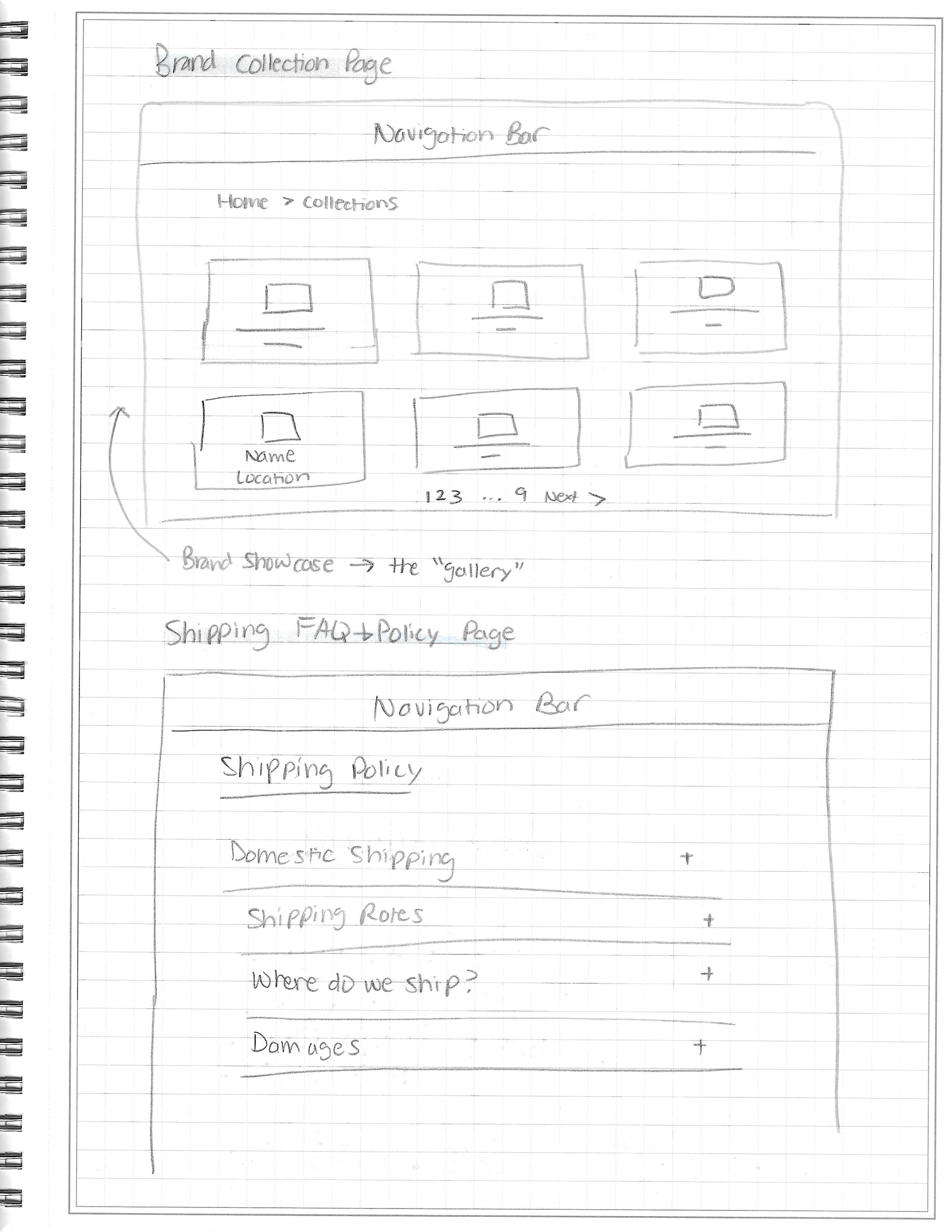
Figure 5. Sketch of desktop brand collection & shipping policy FAQ page.
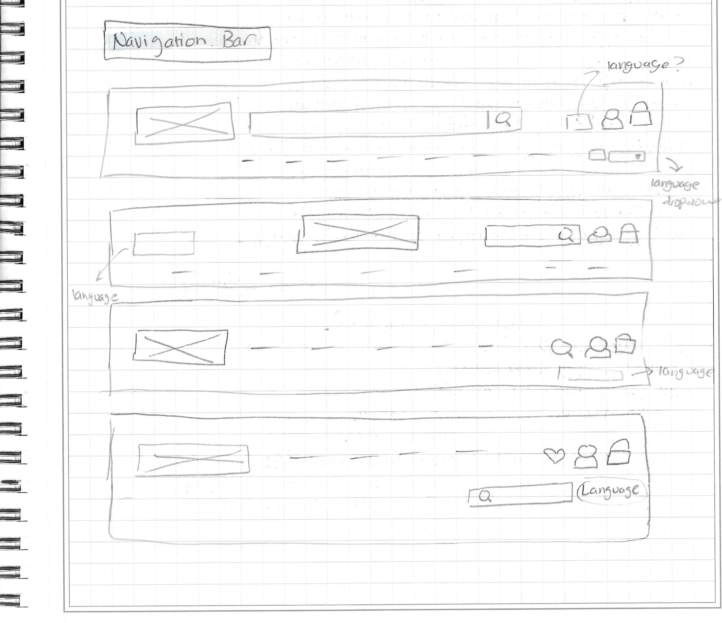
Figure 6. Sketches of desktop navigation bar variations.
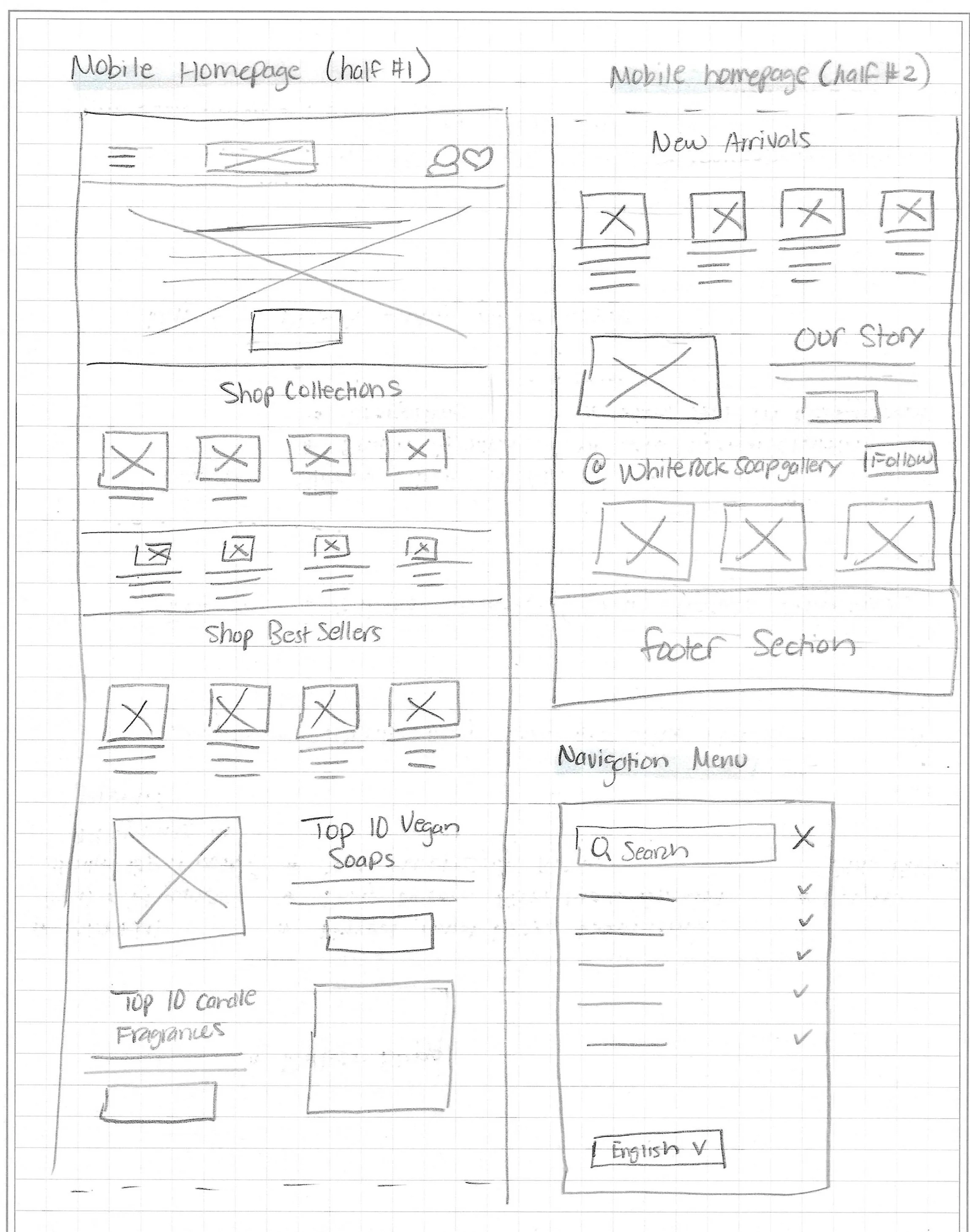
Figure 7. Sketches of mobile home page and side navigation menu.
Low-fi Mobile Wireframes
Full preview of all low-fidelity mobile wireframes can be accessed here.
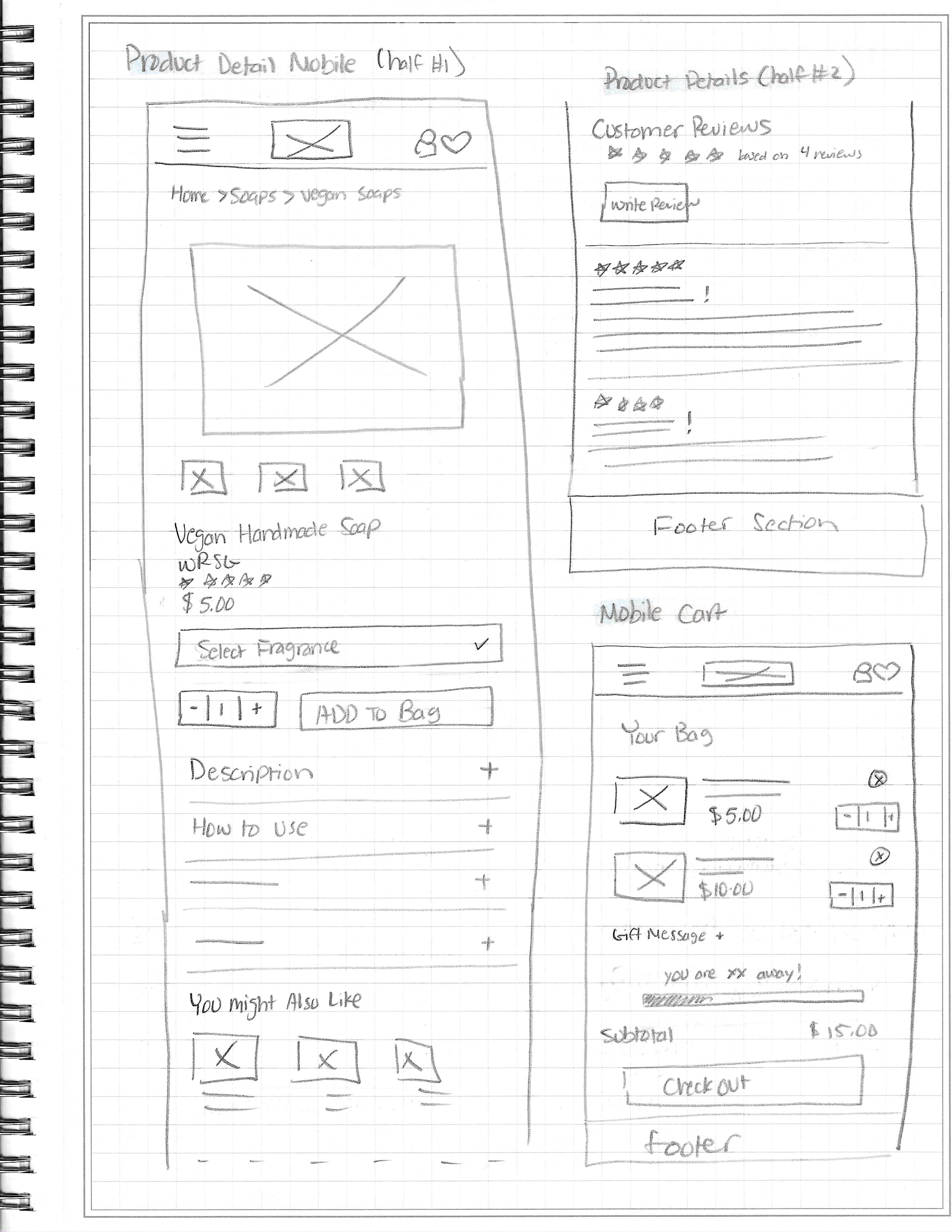
Figure 8. Sketches of mobile product details page and bag modal.
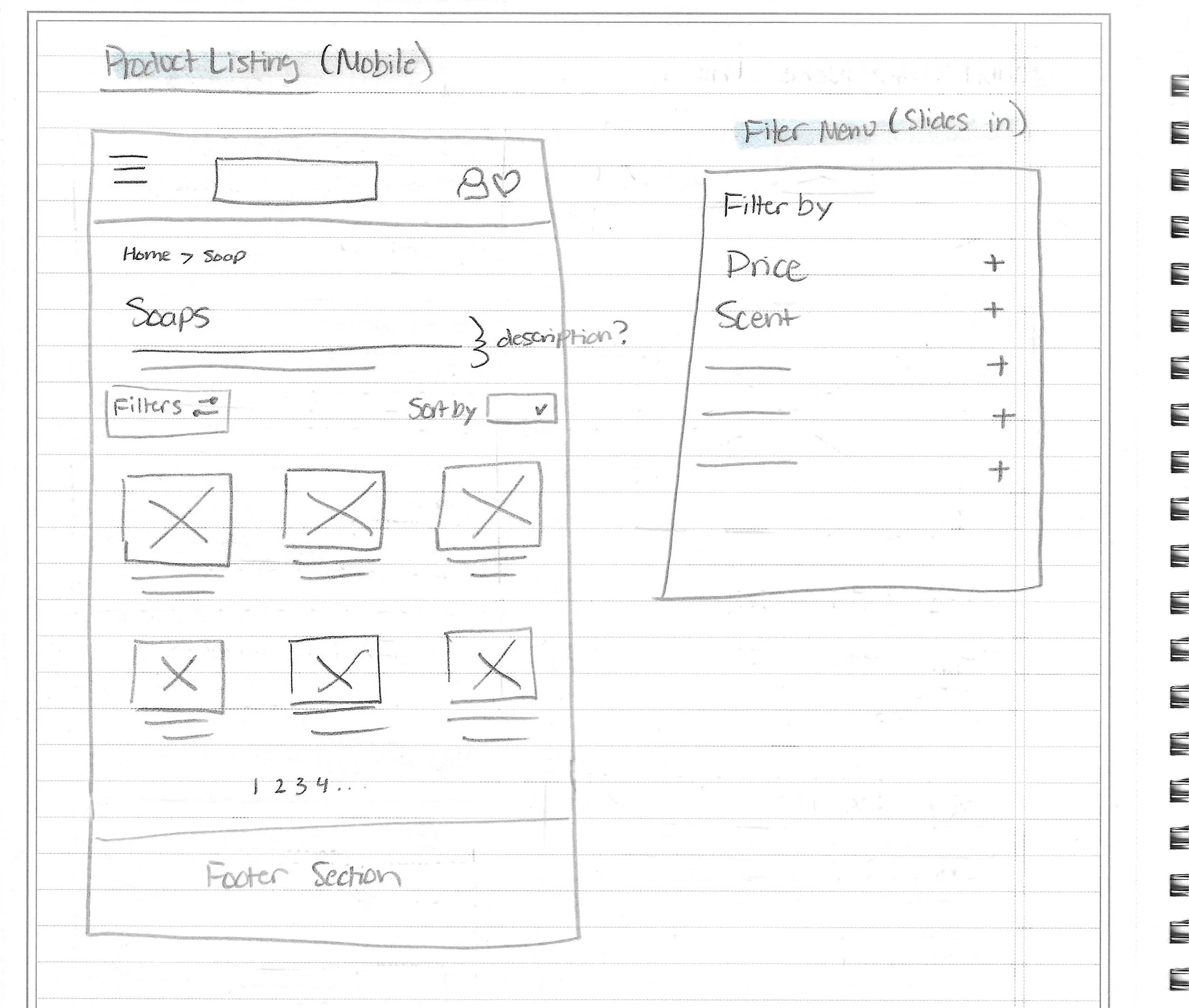
Figure 9. Sketches of mobile product listings page and filters modal.
Mid-fidelity Wireframes
Mid-fi Desktop Wireframes
Full preview of all mid-fidelity desktop wireframes can be accessed here.
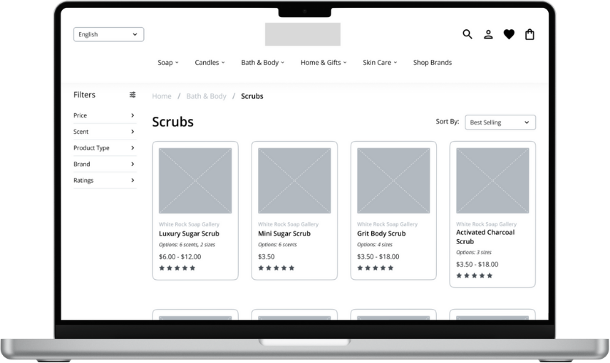
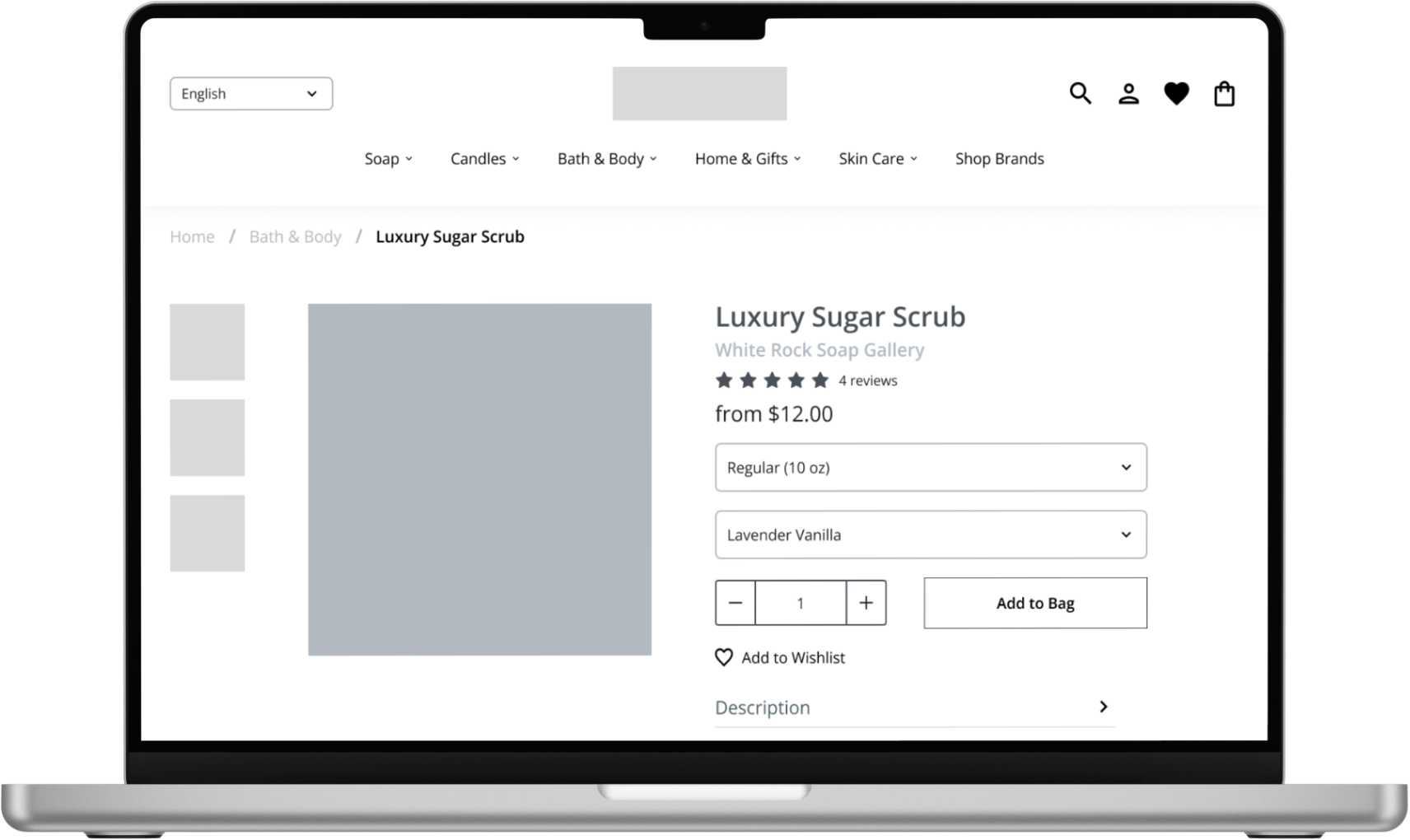
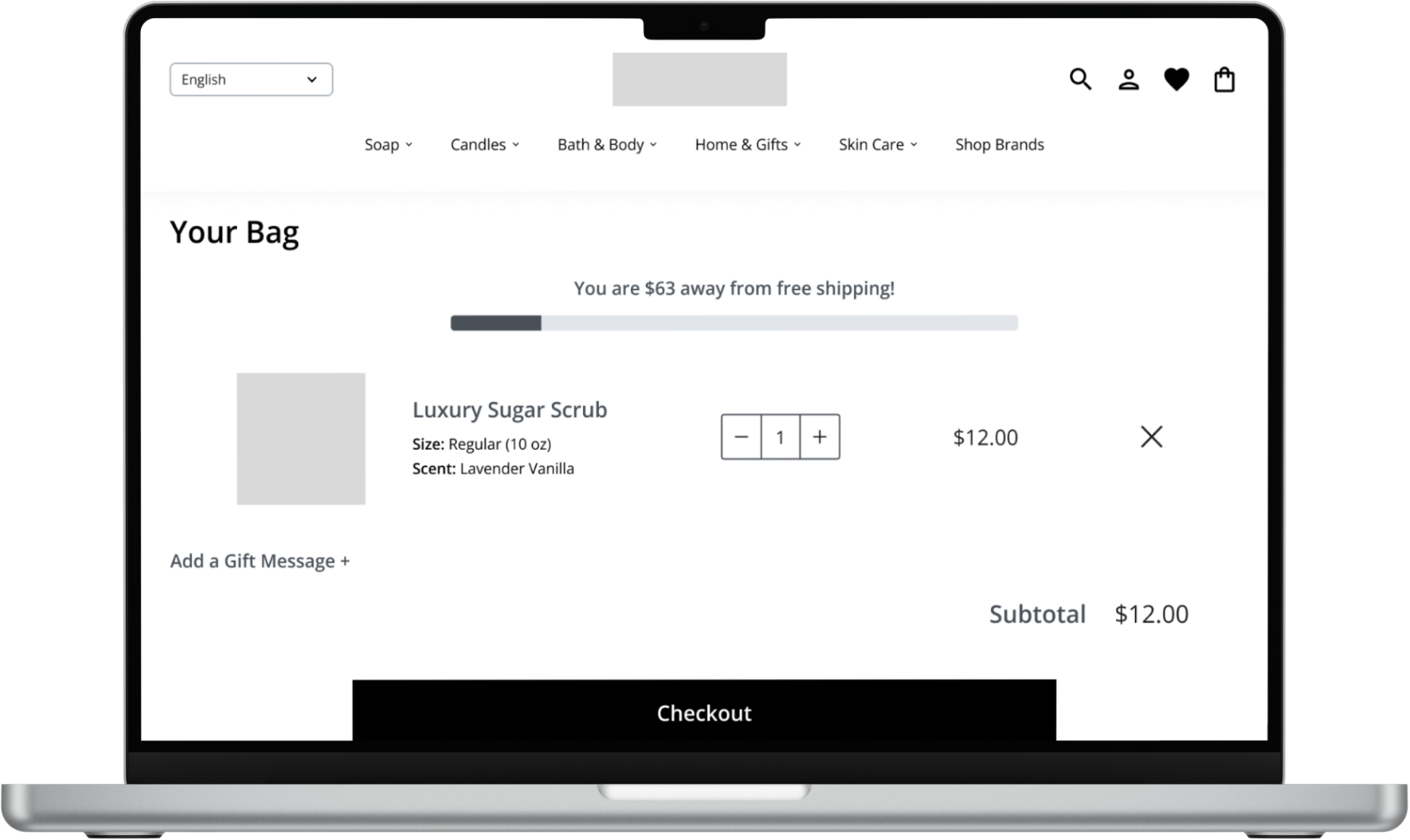
Figure 10-13. Mid-fidelity wireframes of desktop home, product listing, product detail, and bag pages.
Mid-fidelity Mobile Wireframes
Full preview of all mid-fidelity desktop wireframes can be accessed here.
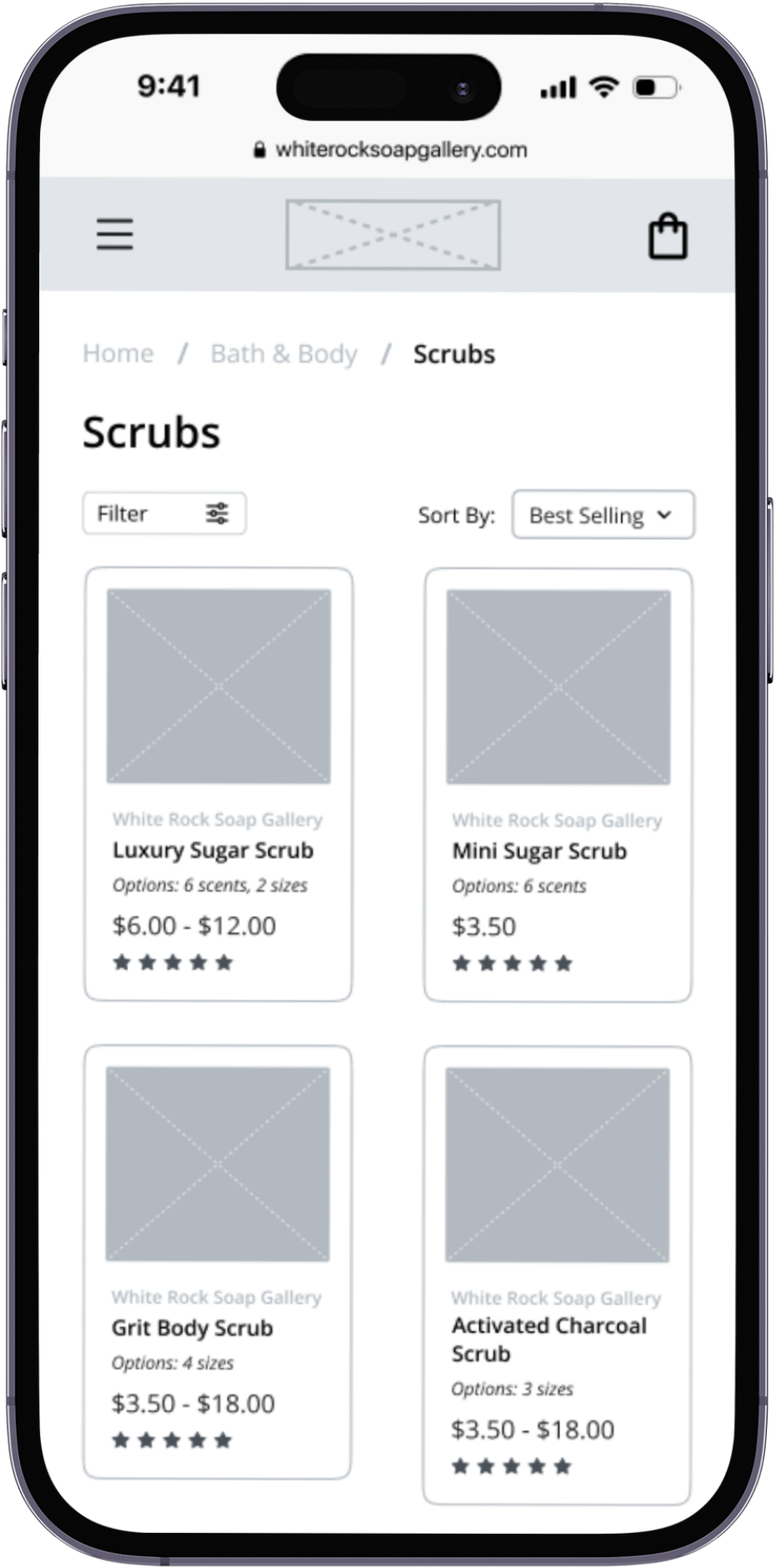
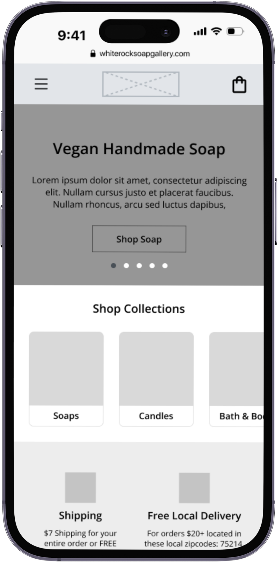
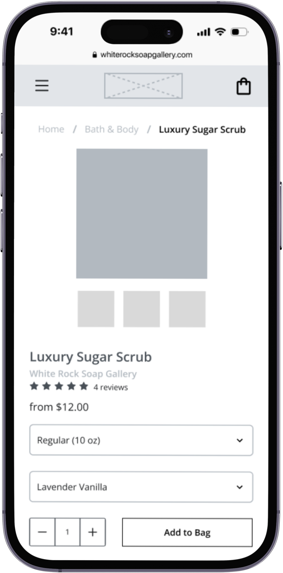
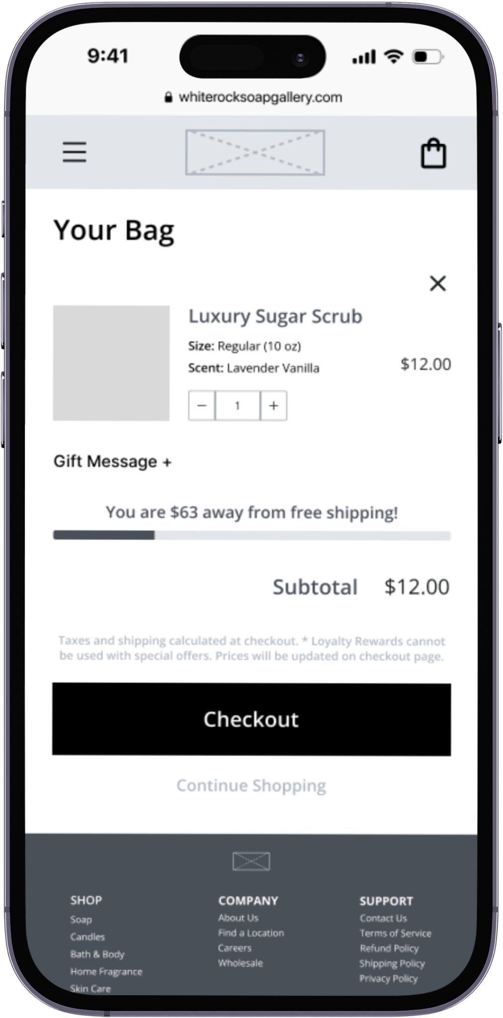
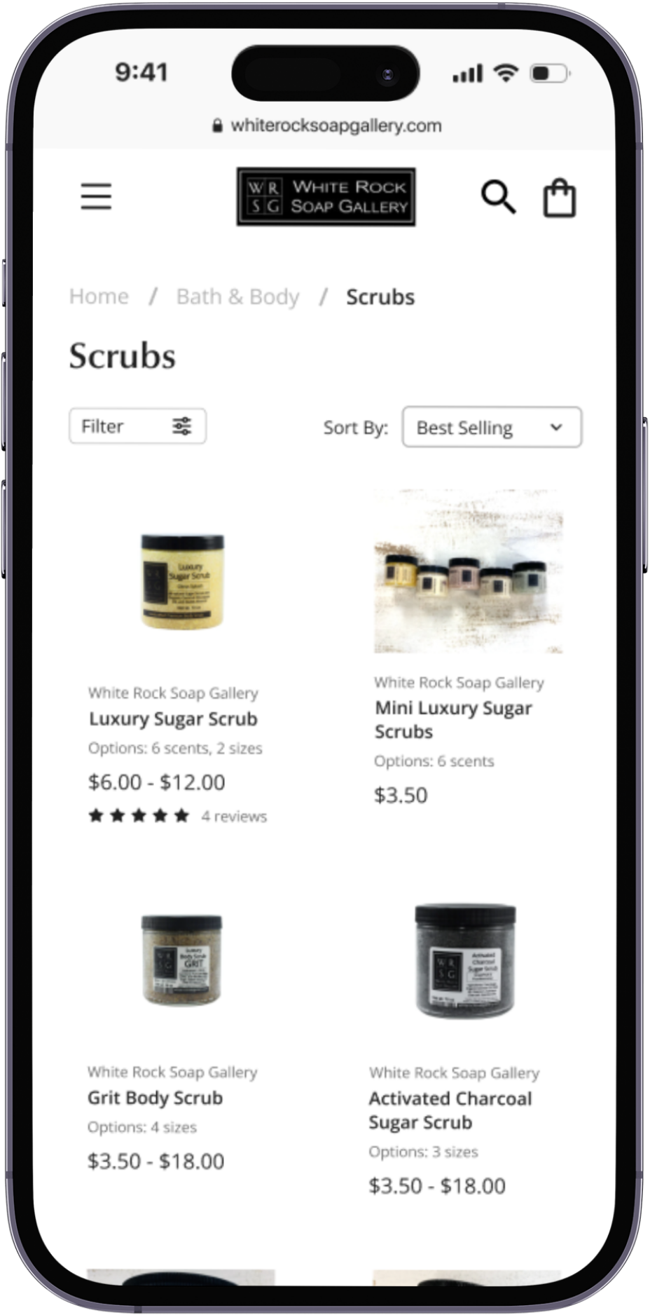
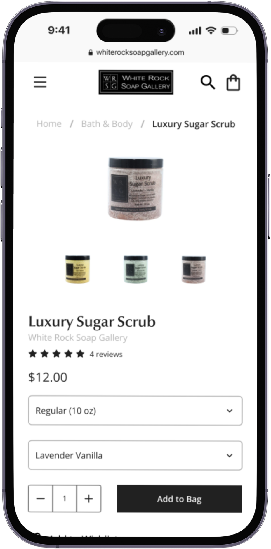
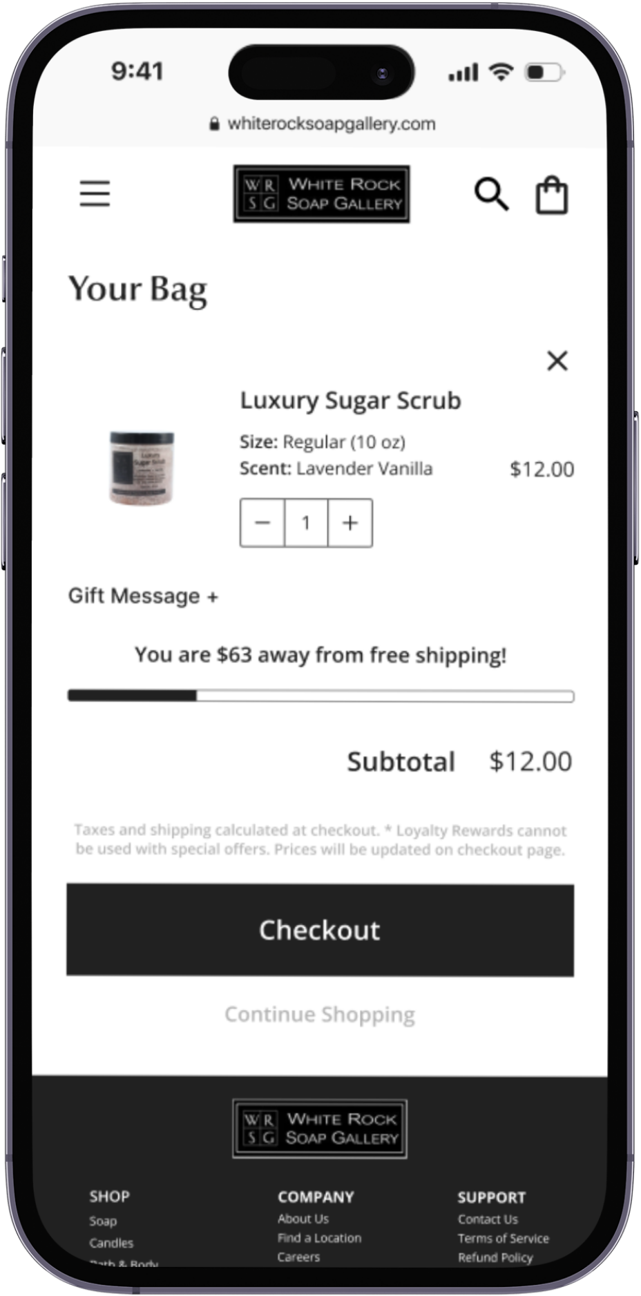
Figure 14-17. Mid-fidelity wireframes of mobile home, product listing, product detail, and bag pages.
First Impressions: Mid-Fidelity Usability Testing
At a Glance
Participants were asked to complete two separate tests, one for the desktop version of the responsive website and one for the mobile version of the site. A five-point difficulty scale was used to measure ease of use during usability testing. Once participants had finished the mock shopping task, they were asked to rate the difficulty of completing that task on a scale of one (1) to five (5) with one (1) being “very easy.”
Mid-fidelity testing consisted of asking participants to perform one task that can be broken down into three parts:
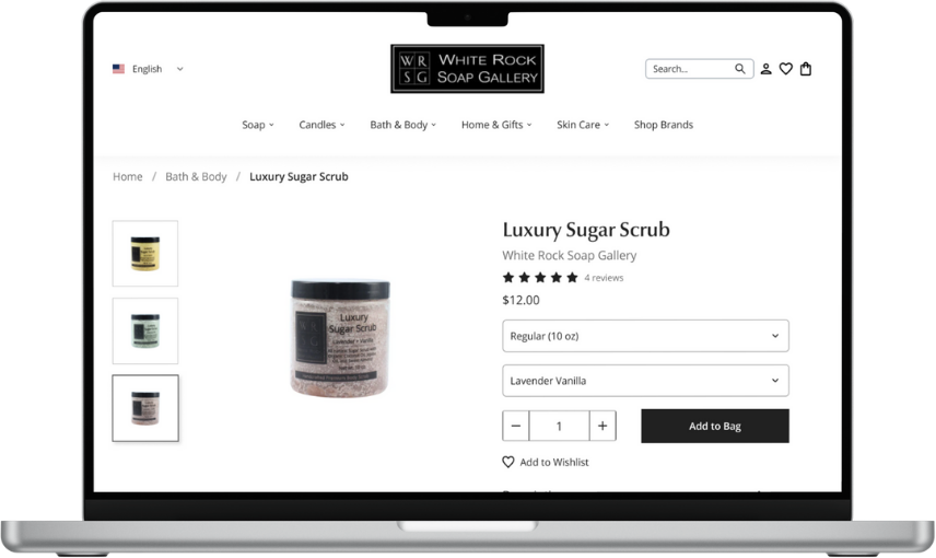
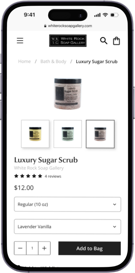
Browsing for the Luxury Sugar Scrub product
Selecting the specified size & fragrance
Adding product to bag and proceeding to checkout (note: no actual checkout flow tested)
Results & User Suggestions
A full summary of the mid-fidelity usability test results can be viewed here. Users noted the following during testing:
both desktop and mobile designs displayed and categorized information as they expected, were straightforward and easy to navigate, and simple and intuitive to follow on account of following familiar design patterns.
added element that tracked how much more was needed for free shipping was well received.
Notable suggestions that came from mid-fidelity testing included:
Revising the title on a modal that appears when users add an item to the cart to show a “added to bag” confirmation message rather than just displaying “Your Bag.” This would clarify the intentions of the modal.
Making the Bath & Body element under the “Shop by Collection” section functional so it acts as an alternate way to navigate to the product listings.
[Mobile Specific] Adding a way to to go back to a previous level in the sidebar navigation without having to close it completely.
A Squeaky Clean Design: Hi-fidelity Prototyping
High-fidelity Desktop Prototype
A few key screens of the high-fidelity prototype before usability testing are shown below. A full preview of all screens used in the usability test can be found here.
Figure 18-22. High-fidelity wireframes of desktop home, product listing, product detail, and bag pages and bag modal.
High-fidelity Mobile Prototype
A few key screens of the high-fidelity prototype before usability testing are shown below. A full preview of all screens used in the usability test can be found here.
Figure 23-26. High-fidelity wireframes of mobile home, product listing, product detail, and bag pages.
Second Run: High-Fidelity Usability Testing
At a Glance
High-fidelity usability testing consisted of asking participants to perform one task that can be broken down into three parts:
Browsing for the Luxury Sugar Scrub product
Selecting the specified size & fragrance
Adding product to bag and proceeding to checkout (note: no actual checkout flow tested)
This task was completed on both versions of the WRSG website and was followed by a debriefing and discussion period. A five-point difficulty scale was used to measure ease of use during usability testing. Once participants had finished a task, they were asked to rate the difficulty of completing that task on a scale of one (1) to five (5) with one being “very easy.”
Results
A full summary of the high-fidelity usability test results can be viewed here.
Overall, users did not find any difficulty in completing the task, and they did not note any confusion about that specific flow itself. Users noted the following during testing:
the designs were clean, cohesive, modern, and well-organized
the navigation experience to be very straightforward, and the layout made content easy for users to read.
Iterative Design
A New Iteration of WRSG’s Design
Based on what was observed during usability testing and the suggestions for improvements from users, the following changes were made to the WRSG design:
1) Increasing the font size and spacing for some items, like the desktop navigation, for increased accessibility and clearer information hierarchy.
Original
1)
Iteration
1)
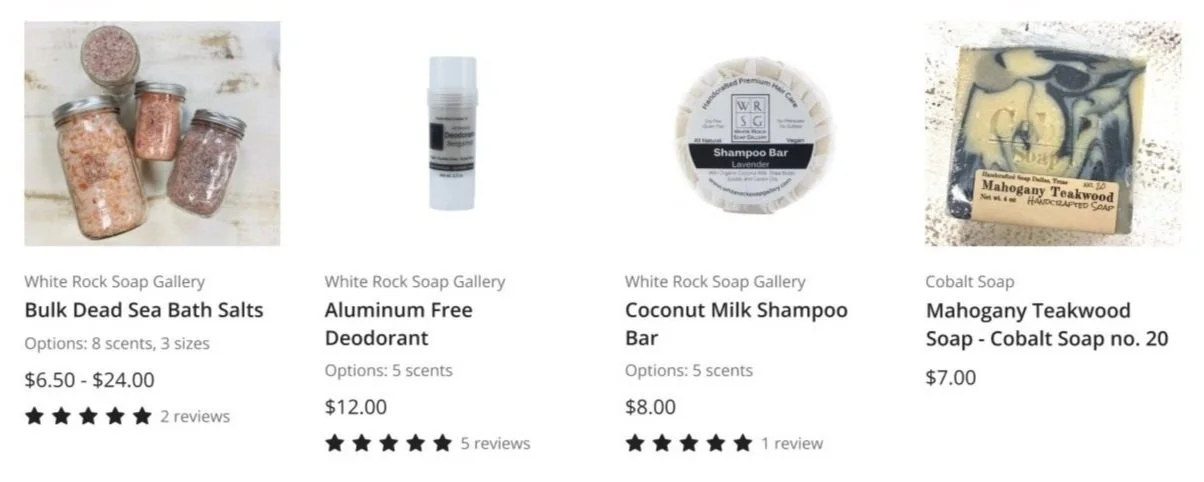
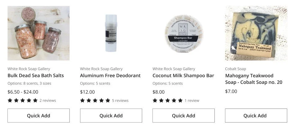
2) Maintaining consistent lines of text on each product listing and adding a “Quick Add” function.
Original
2)
2)
Iteration + New Quick Add Modal
2)
2)
Conclusion
Final Thoughts
Redesigning the WRSG website for this project only scratched the surface on what could be done to improve the layout and usability of the desktop and mobile sites. With WRSG having such a vast variety of products and brands in stock, it was crucial to prioritize site navigation and how products were displayed for users to browse. As such, the scope of this project mainly focused on information hierarchy as well as brand and visual consistency.
Even though there was already an existing product to base my ideas on, redesigning the WRSG website opened the door for a lot of potential directions for the new design to go in, and the possibilities made this project a little daunting. Still, I had a general plan going into this project, and I think having that plan helped me manage the many steps I needed to take in order to conduct research and start designing.
The next steps for this project is to share this redesign and user research findings with WRSG stakeholders in hopes of expanding this project further and opening new doors.


